Match Your Brand
Style the Sophi Shopify blocks and chat button to match your theme with the Sophi appearance app embed — corners, chip colours, icon, banner alignment, chat-button font and custom CSS — with a live demo of every setting.
Out of the box the Sophi blocks are neutral: grey panels, white rounded chips and a dark chat button. Three places set how they look:
| Where | What it sets |
|---|---|
| Each block's settings | That block's background and text colour |
| Sophi assistant embed | The launcher's text and colours (Launcher and panel) |
| Sophi appearance embed (optional) | Everything shared: corners, chips, icon, banner alignment, chat-button font, custom CSS |
To use the third, open App embeds in the theme editor and switch on Sophi appearance. It only adds styles: switched off, the defaults stay, and nothing else about the assistant changes.
Try it
Every control below is a real setting, with the same label and default as in the theme editor. Pick a preset, or change any value; the list under the demo is what to enter in your theme.
- Corners:
Rounded - Question chips:
#ffffff/#d1d5db/#111111 - Show the ✦ mark on chips:
on - Icon next to the assistant name:
Sophi spark - Banner alignment:
Left - Chat button:
System font,As written - Each block, Background / Text:
#f2f2f2/#111111 - Launcher colour / text colour:
#111827/#ffffff
Settings
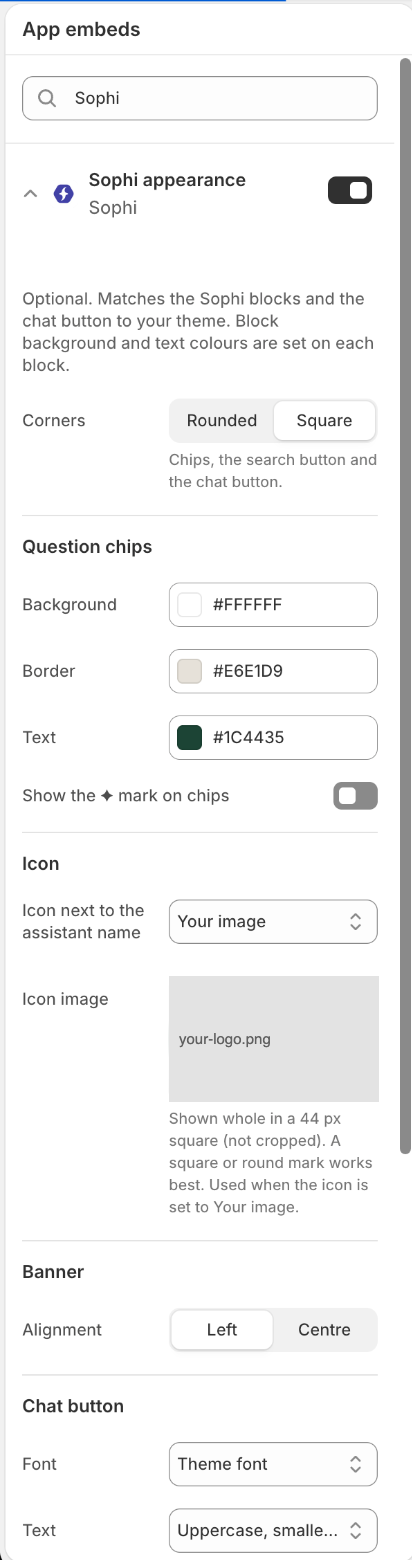
The Sophi appearance embed in the theme editor, set up like the demo's Natural preset:
- Corners — Square
- Question chips — white background,
#E6E1D9border,#1C4435text; the ✦ mark off - Icon — Your image, with the store's logo uploaded (replaced here)
- Banner — Left
- Chat button — Theme font, uppercase
Below these: the Custom CSS box.
| Setting | Options | Notes |
|---|---|---|
| Corners | Rounded · Square | Chips, the Ask AI button and the launcher. Square suits themes with sharp buttons. |
| Question chips: Background / Border / Text | colours; default #ffffff / #d1d5db / #111111 | Shared by every block's chips and the Ask AI button. On hover the border takes the text colour. |
| Show the ✦ mark on chips | on · off | The small spark before each chip's text. |
| Icon next to the assistant name | Sophi spark · Your image · No icon | Your image uses Icon image: shown whole in a 44 px square, not cropped, so a square or round mark works best. Upload a PNG or SVG with a transparent background. |
| Banner: Alignment | Left · Centre | The banner's heading, name and chips. |
| Chat button: Font | System font · Theme font | Theme font uses your theme's body font. |
| Chat button: Text | As written · Uppercase, smaller and spaced | Uppercase follows the store language (Turkish i becomes İ). |
| Custom CSS | text | See below. |
Choosing colours
- Use your theme's own colours. In the theme editor, Theme settings → Colors shows them; copy the hex values.
- A block's background usually works best as your theme's soft background tone (an off-white or light beige), with your main text or brand colour as its text.
- Keep chip text readable on the chip background: aim for a contrast ratio of at least 4.5:1.
Custom CSS
For anything the settings don't cover, write CSS in the Custom CSS box of the
Sophi appearance embed. Your rules override Sophi's, wherever Shopify places them
on the page. Write plain rules; @font-face and @import don't work here (put
fonts in your theme). Needs a browser from 2023 or later.
| Class | Element |
|---|---|
.sophi-block | Every block (banner, product box, search recovery, cart questions) |
.sophi-banner | The banner (its heading: .sophi-banner__heading) |
.sophi-product | The product box |
.sophi-brand | Icon and assistant name / title row |
.sophi-brand__icon | The icon |
.sophi-chip | A question chip |
.sophi-search-ask | The Ask AI button next to search fields |
#sophi-launcher | The floating launcher |
/* Chips: a darker border on hover, a little more space inside */
.sophi-chip:hover { border-color: #1c4435; }
.sophi-chip { padding: 12px 20px; }

/* The banner heading in the heading font (Dawn-family themes) */
.sophi-banner__heading { font-family: var(--font-heading-family); }

/* Hide the launcher on phones */
@media (max-width: 749px) { #sophi-launcher { display: none; } }Rules in your theme's own Custom CSS may lose to Sophi's styles. Put Sophi rules in the Sophi appearance box instead.
The chat itself
The chat window, both on the chat page and in the side panel, is Sophi's chat widget. Its look — colours, fonts, your logo, the welcome message — is set up by the Sophi team for your store, not in the theme editor. Send us your brand colours, fonts and logo, and we match the chat to your store.
Next: Events and purchases.
Set Up the Theme
Click-by-click theme editor setup for the Sophi Shopify app — work on a theme copy, create the chat page and its template, fill in every Sophi assistant setting, and place the banner, product box, search recovery and cart blocks.
Events and Purchases
How the Sophi Shopify app tracks storefront events and purchases — the events it sends, the purchase pixel Sophi creates, how Shopify consent controls both, and how guest and logged-in shoppers are recognised.